I briefly present in this document some observations I made and studies I did over the summer, whose results I think will be useful as a starting point for more in depth analysis.
All the figures cited here are located on pcfcal01 in /home/fcaltbmon/adam/doc/figs if the links don't work.
Medium and High Gain Multiplicative Factor
To determine the multiplicative factor between medium and high gains, I used calibration data taken before the test beam. I used data with a delay scan and built pulse shapes of 1 ns resolution. I found the height of the pulses by finding the maximum point along the pulse. Such heights were obtained for all of the DAC values in the file, and for both gains, medium and high.
To demonstrate ADC linearity, I plotted the DAC value versus pulse height. I found that it was fairly linear, but that the low DAC points deviated more and more from the fitted line. It turns out that a DAC 0 has a non-negligible amplitude; indeed, it creates a pulse. See adc0_pulse.ps, which plots this shape using a channel pulsed with DAC 0. It needs to be subtracted from any other DAC value, as it is a "baseline" pulse built into all pulses. With this subtracted, the linear relationship between DAC and pulse height is excellent.
What does not seem to be as nice -- and I only discovered this recently -- is that the slope of this line does not seem to be constant. The following postscript files show a plot of DAC value along the x-axis and ADC value on the y-axis. High gain data are used. The errorbars are RMSs of the spread of pulse heights, since channels were pulsed multiple times per DAC and per delay. A0 is the y-intercept of the fit, and A1 is the slope. The fit uses the least-squares method.
The slopes are significantly different from plot to plot, even between the same channel but with different run files (cal570.dat vs. cal578.dat). Cal570 only pulses FEB 0, channel 0, while Cal578 pulses every fourth channel on FEB 0. For Cal578, I also made a plot which combines the pulses of all the pulsed channels (for each DAC), so that a single pulse is produced from all. The result is adc_578_all.ps.
The results from this brief study:
| Calib. File | Channel | Pulse Height : ADC ratio |
| cal570.dat | 0 | 2.450 +/- 0.005 |
| cal578.dat | 0 | 2.075 +/- 0.005 |
| cal578.dat | 4 | 2.087 +/- 0.005 |
| cal578.dat | 108 | 2.090 +/- 0.005 |
| cal578.dat | all pulsed | 2.09 +/- 0.03 |
It appears the difference is mainly between the two runs.
The intergain value was calculated by taking the ratio of the high gain to the medium gain pulse height for each DAC, and then doing a least-squares fit of these points to a straight line. The slope of the line should be 0, and the y-intercept gives us the over-all ratio of the gains. At the beginning of the summer, I used the data from cal570.dat, channel 0 (the only channel pulsed), and got a value of 9.4 +/- 0.1. To-day, however, I checked cal578.dat as well, and it appears that, like above, this factor changes from channel to channel, but not, perhaps, from run to run. The following plots use the same data as the ADC linearity study.
Summarised:
| Calib. File | Channel | Gain 3 : Gain 2 ratio |
| cal570.dat | 0 | 9.4 +/- 0.1 |
| cal578.dat | 0 | 9.4 +/- 0.1 |
| cal578.dat | 4 | 9.49 +/- 0.05 |
| cal578.dat | 108 | 9.07 +/- 0.05 |
| cal578.dat | all pulsed | 9.2 +/- 0.2 |
It is possible that these ratios will need to be calculated for every run.
For both the DAC vs. pulse height and the intergain ratio, further study is warranted. I only discovered these peculiarities today and have no time to investigate myself. I have a couple of theories. First, it may be that these values really do vary from channel to channel and/or from run to run. This makes analysis more painful. Second, it is possible that these differences have to do with the pulser, or some other hardware. They may conceivably depend on the pulsing pattern.
The code used to produce the data used here is on pcfcal01 in /home/fcaltbmon/adam/other/adcgain, called adcgain.cpp. All the data files used to get these plots are
also in this directory.
Pedestals
I found two main things about the pedestals.
These data were taken from the output files produced by my process class, which is described in my software reference.
Channel Autocorrelations
I worked a little bit on this with John Rutherfoord. The idea was to see what the correlations between the samples in one channel are. I used pedestal events for my study.
I calculated the correlations between all the possible combinations of samples; adjacent samples, samples 2 apart, 3 apart, etc., using the formula
                    <pipj> — <pi><pj>
     cij = -------------------------------------                               (1)
            [(<pipi> — <pi>)2(<pjpj> — <pj>)2]1/2
     c00   c01   c02   ...   c0n
     c10   c11   c12   ...   c1n
     c20   c21   c22   ...   c2n
      .               .      .
      .                .     .
      .                 .    .
     cn0   cn1   cn2   ...   cnn
 1.000  -0.039  -0.317  -0.055   0.098  -0.069  -0.094
-0.039   1.000  -0.035  -0.324  -0.051   0.113  -0.078
-0.317  -0.035   1.000  -0.046  -0.307  -0.068   0.099
-0.055  -0.324  -0.046   1.000  -0.008  -0.300  -0.062
 0.098  -0.051  -0.307  -0.008   1.000  -0.032  -0.322
-0.069   0.113  -0.068  -0.300  -0.032   1.000  -0.027
-0.094  -0.078   0.099  -0.062  -0.322  -0.027   1.000
Immediately, we notice that the main diagonal is always 1.000, which makes sense, since a sample is completely correlated with itself. Also note that off-diagonals all have similar numbers. This corresponds to the property that the samples are, in a manner of speaking, indistinguishable. For example, looking at the second off-diagonals (the entries two above and two below the main diagonal, we see that the values are all around -0.31. That is, samples two apart (e.g., 4 & 6, 5 & 3) generally have a correlation of -0.31. By taking these common diagonal values (in the case of real data, such as the matrix above, taking the average of the off-diagonal values) we can create an "autocorrelation" plot, which shows the correlation as a function of sample separation difference.
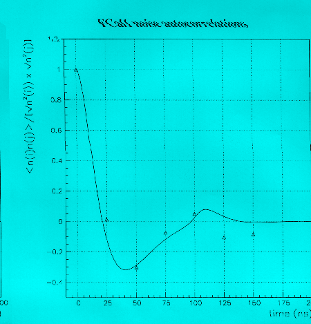
The plots in corr_realdata.ps show autocorrelation plots for different channels from the runs run3300.dat — run3309.dat. All of the randomly selected channels show a similar curve, but they are not all identical — compare FEB 6, channel 0, for example, to the other plots.
John Rutherfoord has modelled this autocorrelation and produced a continuous autocorrelation function from the model. The points found from the data agree quite nicely with this model, up to the last two points. See corr_pointstomodel.gif, which plots his function with my plots overlaid in triangles (scanned in, not great quality).
Knowing the autocorrelation is important for two reasons. First, it can be used to evaluate models of the electronics which produce functions such as the one in corr_pointstomodel.gif. Second, the sample-to-sample correlations are necessary information for proper fitting of pulses to a pulse shape, which must take the coherent noise into account. At the time of writing John Rutherfoord has been working on fitting pulses to modelled shapes and should know more about this.
The code used to generate these results is located on pcfcal01 in /home/fcaltbmon/adam/other/noise.
TTC Timing
I wrote a longer note about determining the trigger time from the two TTC values given for each event, called
timing.ps.
Using Splines to Determine Pulse Heights
Using a spline interpolation is not a very precise way of estimating the peak height of a pulse. I wrote a note,
spline.ps, to explain why.
Pulses and Parabolae
Drawing a parabola through the top three samples of physics is a quick way of estimating the amplitude of a pulse, but as I discovered, is not very good method. It is worse than using splines (see the note above, though much easier to implement.
My motivation for studying the goodness of the parabola method was the desire to create a "true" pulse shape, that is, a pulse shape calculated using pure physics data.
My method for creating such a shape was to overlay thousands of physics events, with the correct delay timing taken into account. The file parab_overlay.ps shows an overlay of events with a maximum sample of at least 50 ADC from run1555.dat.
The next step is to normalise all the pulses to unity. To normalise the pulses, I used the parabola method; that is, I drew a parabola through the top three points, and then took the peak of the parabola as the pulse height. Pulses were then binned according to their delay and each bin was divided by the number of entries. In this way, a smooth pulse shape is created: parab_pulseshape.ps is an example, using 0.5 ns bins on runs 1555 to 1564, FEB 6, channel 23.
There are noticeable flaws with this plot, however. Most obvious is the flattening of the negative lobe, which is partly due to biases in this method. Closer inspection shows that the shape of the first positive peak looks too rounded, and is not smoothly connected to the rising and falling of the pulse.
The plot parab_nobinning.ps uses the same procedure and data (but only one run, 1555) as the last plot, except that no binning is done. Here we see more clearly the strange shape of the first maximum, which seems to have an artificial rounding, and too much flattening on the top.
To investigate this further, I turned to calibration runs. Here, the peak height can be determined by using a calibration run with a delay scan, which allows a smooth pulse shape to be determined. The maximum of the pulse can be determined by selecting the maximum sample in the pulse. Then, by going through and fitting parabolae to individual events (which are sampled every 25 ns), one can compare the parabolic height to the actual height. The following is data from cal10803.dat.
| Delay (ns) | Parabola Centre (ns) | Parabola Height (ADC) |
| 0 | 63 | 1722 |
| -3 | 68 | 1782 |
| -6 | 72 | 1883 |
| -9 | 75 | 1992 |
| -12 | 76 | 2077 |
| -15 | 77 | 2081 |
| -18 | 79 | 2039 |
| -21 | 81 | 1931 |
| Actual Centre & Height | 63 | 2072 |
These data are plotted in parab_calib.ps. Clearly, the amplitude (and timing) given by a parabola is very sensitive to the timing of the pulse. A solution, on first thought, might be to find a function (such as a polynomial) which describes the relation between the delay and the parabola height. The problem with this, however, is that the calibration pulse shape is quite different from the physics pulse shape, even in its fundamentals, such as the width of the peak. Calibration pulse shapes are therefore poor models of physics pulse shapes.
To get a better pulse shape than the one of parab_pulseshape.ps, one needs to use a modelled pulse shape to do the renormalisation. John Rutherfoord has been working on such a system, using SPICE to help him create the model shape and has been getting improving results.
The parabolic pulse shape was created using the code in pulse.cpp on pcfcal01 in /home/fcaltbmon/adam/other/pulse. The parabola height as a function of delay study was
done using calib.cpp (parabolastudy function) in the same directory.
The depression in the pulse shape after the negative lobe (centred at about 300 ns in parab_pulseshape.ps) was confirmed by John Rutherfoord from his
analysis to be real, and not a bias in the parabolic method used to create my shapes. He found that the only possible mechanism for creating such a depression in his SPICE model was a reflection due
to an impedance mismatch between the cables going to the cryostat and the preamp.
I confirmed that this was the case by comparing calibration runs, some with the cables plugged into the front end crate, and others with the cables unplugged. If the impedances were equal, one
would expect the pulses from unplugged runs to be exactly twice as high as plugged in runs. The reason for this is that when the cables are plugged in, the signal from the pulser gets split in two,
half going into the preamp, and half running down the cables. With differing impedances, this ratio will not be 2. From John's simulations, he expected the ratio to be
A summary of my findings is in cables.dat (ASCII text file). The peak heights were determined simply by finding the maximum sample (the
runs were sampled every 3 ns). The error is an RMS spread of these maxima; I used 6 run files to find each height. The reason the errors are smaller in the final ratios than the spread of values may
be due to the perhaps crude method of taking the maximum sample as the peak height: the maximum sample stays quite constant run-to-run for a given calibration series, so its RMS is low, but it might
be systematically lower than the true peak height.
On average, the ratio was about 2.16. With a measured impedance of about 25 ohms (supplied by J. R.), formula (2) gives an impedance of the preamps of about 29 ohms, or 4 ohms higher than the
cables.
Cable Impedance
1 + Zp / Zc (2)
where Zp is the input impededance of the preamp and Zc the impedance of the cables.